

Last Updated on
Microsoft Excel can be used to make Gantt charts, perfect for displaying project schedules. In our helpful guide below, we’ll take you through how to make a Gannt chart of your own in Excel.
How To Make A Gantt Chart In Excel
Below are the steps on how to make a Gantt Chart in excel.
Step
Use Excel To List Your Project’s Schedule
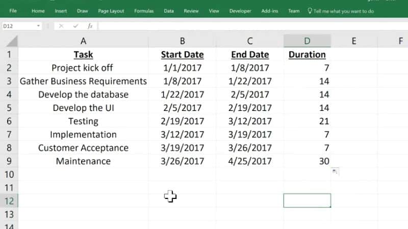
First, you will need to break your project down into phases of work, with individual stages that need to be reached at certain times.
Once you’ve done that, you’ll want to put those phases into an Excel table.
To do this, create the column headings you’ll need. These include starting date, finishing date, a phase description, and how many days for completion (the “Duration”).
Put each of these headings into Excel columns next to each other, then fill out the phases underneath each.
Step
Turning Your Data Into A Bar Chart
Once you’ve filled out your table of phases, click on a blank cell. “Cells” are the empty squares which you type in that make up an Excel document. Once you’ve clicked on one, go to the top of the screen and click the “Insert” heading.
From the options that appear beneath it, find the “bar Chart” just to the right of the middle. Then, from its drop-down menu, click “Stacked Bar” from the “2-D Bar” section. A blank chart space will appear.
Step
Adding Your Starting Dates To The Gnatt Chart
Click your right cursor on the blank chart, then hit “Select Data…”. On the new window, select “Add” from the left box.
A window for “Edit Series” will open. Click the box under “Series name”, followed by the “Start Date” column heading of your table.
Then click the box beneath “Series values”, before clicking on the first starting date from your column and dragging the cursor to the final starting date. Click “OK”.
The Gantt will now have all “Start Dates” added, so you need to now add the other columns.
Step
Adding Durations
Now you’re doing the same again for the “Duration” column. In the previous “Select Data…” window, click “Add” again.
When the window for “Edit Series” opens, click on the “Series name” box and then select the “Duration” column heading from your table. It will bind that to the “Series name” section.
Then click the “Series values” box, before clicking the beginning “Duration” value and dragging your mouse to the final “Duration” value. Hit “OK”.
Step
Adding Descriptions
The Gantt chart will be developing. Click your right cursor on a blue bar, hitting “Select Date” again. Now you’ll want to click “Edit”, which is in the right-hand “Horizontal (Category)…” box of the new window.
Ignore the “Description” heading this time, instead clicking its first entry and dragging down to its last. Hit “OK”.
Step
Formatting The Gantt Chart
Click your right cursor on a blue bar, then click the bottom option for formatting data.
Next, click the paint bucket icon, then tick the option for “No Fill”. Then hit “Border” and select “No Line”. Visually, your chart will now look more like a Gantt chart.
If you want, you can also reverse your chart headings. First, click on their axis to reveal the “Format Axis” options. Select the “Bar Chart” icon, then tick “Categories in reverse order”.
Final Thoughts
Gantt charts are very helpful for displaying your project schedules. Follow our guide carefully to make a Gantt chart in Microsoft Excel.