Last Updated on
A pie chart is one of the most frequently used charts in Microsoft Excel. And you may be wondering exactly why that is. The simple answer? Because it’s incredibly useful especially if you’re dealing with large amounts of data.
Pie charts can be used to visually represent vast amounts of information in a relatively compact space. They break the data down and allow you to illustrate exactly how several values can make a whole in the form of pie slices.
As a result, it’s pretty easy to make a 2-D pie chart and 3-D pie chart using Microsoft Excel. And you don’t need a degree in graphic design to do so, either!
Without further ado, here’s how to make pie charts in Excel.
What Are Pie Charts Used For?
Pie charts are often used in business to display an array of data. This includes a percentage of revenue from a particular product, types of customers, and even overall turnover of a particular company.
Step
Tried And True Method
This is the most straightforward way to create a pie chart in Excel. Though there are different types of pie charts available to choose from on Excel, it won’t be difficult finding the perfect way to showcase your data.
All you need to do is follow these steps and you’ll be on your way to visualizing your data in no time at all!
- Open Excel
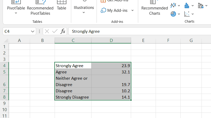
- Create your columns or rows of data (or both if need be). If you opt to label your data then these will be transferred to your pie chart later on.
- In your spreadsheet, highlight the data that you want to plot on your pie chart. Do not select the sum of any numbers as you probably don’t want to display it on your chart.
- In the ribbon, click Insert.
- Here, scroll down to Charts. Then click the Insert Pie or Doughnut Chart option (you can’t miss it, it’s in the shape of a small pie chart).
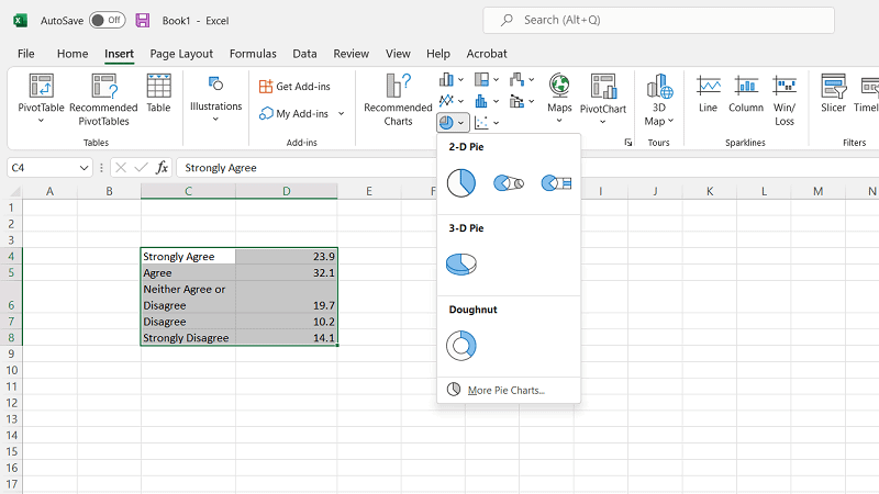
- You should now be able to see various options for creating your pie chart. This includes 2-dimensional and 3-dimensional pie charts. However, you can hover the cursor over your preferred pie chart option to see a sneak preview of what it will look like for your data.
- Once you’ve selected the most applicable chart for you, click it so that it can be added to your page in Excel.
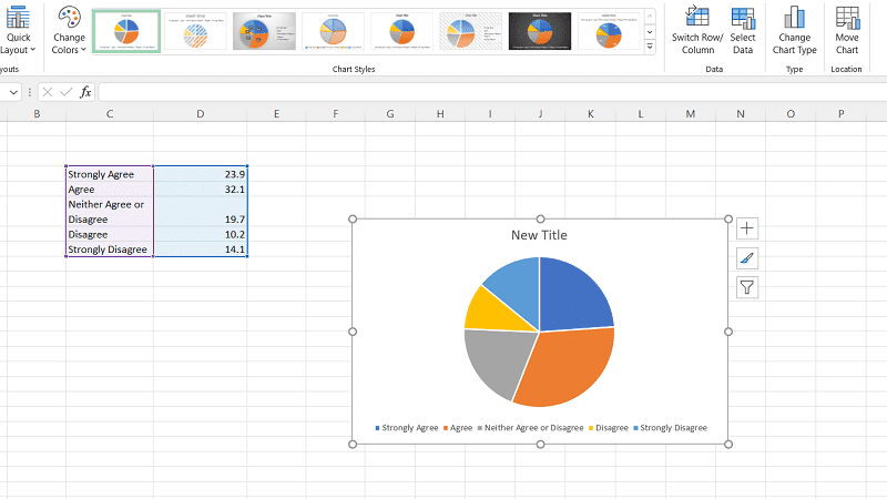
- And you’re done!
Editing Your Pie Chart
If you’ve made a pie chart but aren’t happy with the chart type, you don’t need to worry! It’s relatively easy to make some changes. If you don’t know how, then we’ve outlined some simple methods below.
Step
Text
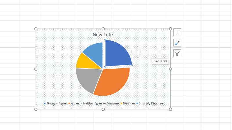
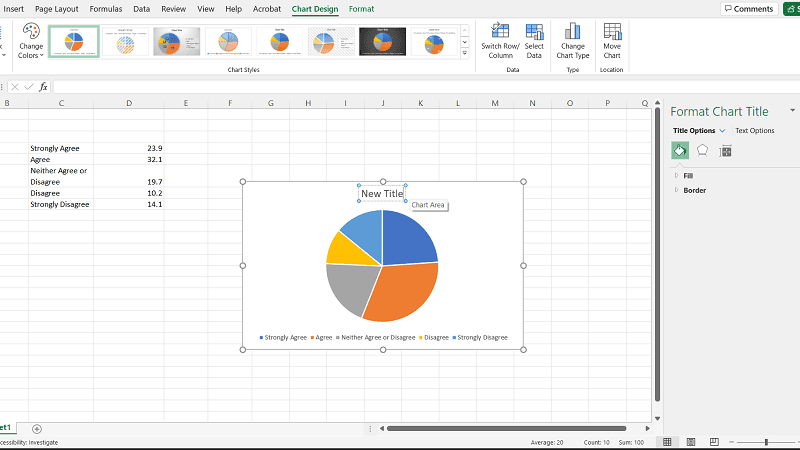
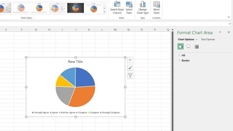
If you want to change the header of the chart all you need to do is double-click the title and enter the new name. You can also change the positioning of your chart on the screen by dragging it and then dropping it in place.
Step
Color
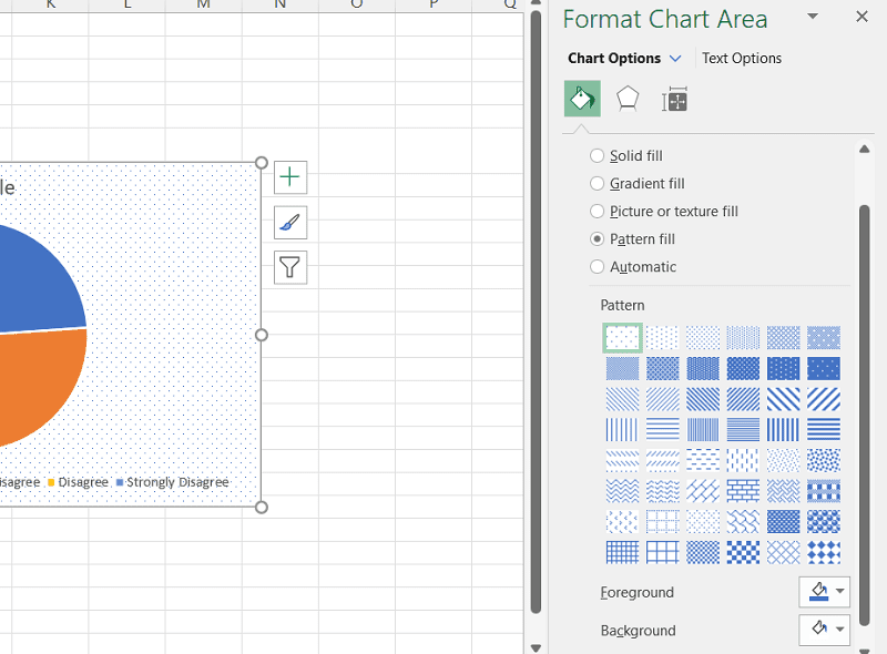
And if you’re all about aesthetics and color scheme, you can even change the background color! All you need to do is click the Format Chart Area side bar.
Then select the paint bucket, choose the fill type (solid color or gradient fill) and your preferred background color. You can even edit the color, width, and transparency of the pie chart border within the Format Chart Area.
Step
Explode Your Pie Chart
To draw attention to a specific section of your pie chart, simply double-click on the piece you want to pull away. Then, drag your cursor until it’s the distance you want it, and you’re all set!