
Last Updated on
Adding a trendline in Excel can help readers to read a chart more clearly, and understand the general trend of the data.
In our handy guide below, we’re going to walk you through how to add a trendline to your Excel charts, whether they already exist or whether they’re new.
How To Add Trendline In Excel
Below are the steps on how to add trendline in Excel.
Step
Open your spreadsheet
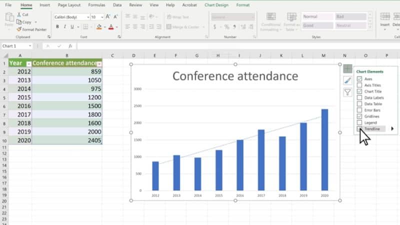
First, open up Microsoft Excel and open the chart that you want to add a trendline to.
Alternatively, create a new chart. To do this, simply enter some data into Excel columns, then highlight them.
Step
Select chart
A “Quick Analysis” icon will appear at the bottom right of them. Click it, select “Charts”, and pick the type that you want. Always pick the type that will suit your data best.
Once you have your chart, select it and some icons will appear at the right-hand side. Click the top one, which will look like a large green addition symbol.
Step
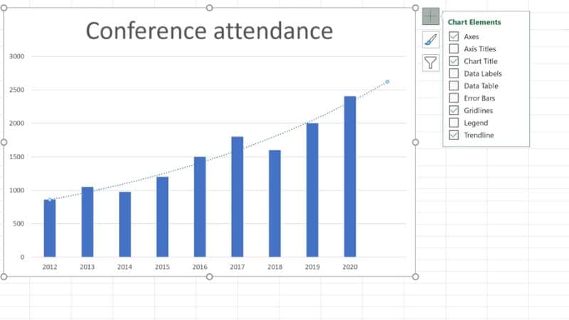
Tick ‘Trendline’
A drop-down menu will appear next to the symbol, with plenty of options to tick or untick, altering your chart in different ways. At the bottom of that list, you will find the “Trendline” option.
Tick it. This will add a linear trendline to your chart, which is a type of best-fit straight line.
Step
Picking A Trend Line
If this isn’t the type that you want, or the type that is best for your data, then hover your cursor over the tickable “Trendline” option. An additional drop-down menu will appear next to it, giving you options for other types of trendlines.
In addition to the linear one, these include Exponential, Linear Forecast, and Two period Moving Average.
If this still isn’t enough, click the bottom option for “More Options…”, which will provide you with yet more types of trendline to add to your chart.
Step
Formatting A Trend Line
This “More Options…” is actually very useful, because it also allows you to format your trendline in a variety of different ways, letting you mold it exactly how you want.
From the pop-up window, you can select these formatting options. The first of them is all about “Fill and Line”, and is accessible via clicking an icon of a bucket of paint.
These options allow you to choose whether your line is solid, a gradient line, or automatic. On top of that, you can also pick its color, choosing the most visually appealing and helpful.
The width of the line can also be altered, making it more or less noticeable, as well as how transparent it is.
The next category for formatting is “Effects”. This is all about special visual effects. For example, you can add a glow to the trendline, or give it a shadow.
Additionally, you can add soft edges to it. These are all about visual appeal and giving the line depth.
The final category is “Trendline Options”, which is where you can pick the specific type of trendline you have – offering the types that weren’t all in the previous menu. These extra pens include trend lines that are logarithmic, polynomial, power, or display a moving average.
On top of these, you can also choose whether the trendline forecasts onwards, continuing past the data you actually have right now. There are plenty of different options to try out.
Final Thoughts
There you have it – how to add trendlines in Excel, making charts even easier to decipher.
Using Excel daily? Check out more of our Excel Guides for the best functions and top tips.