

Last Updated on
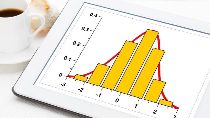
A histogram is a type of graph used to represent numerical data in a similar fashion to a bar chart. These graphs can be used for both continuous and discrete data, making them useful tools for companies to see the distribution of data over a set of predetermined ranges.
On a standard bar chart, which measures discrete data, all of the bars are kept separate, while on a histogram they are often touching each other.
You should use a histogram when you want to show the distribution of numerical data across several categories or demographics (often described as bins). In this guide, we will show you step by step how to create your own histograms in Microsoft Excel.
There are two methods for creating a histogram, depending on what version of Excel you are working with.
Creating A Histogram On Excel 2013/2010
For creating a histogram, you first need to have some data entered into your spreadsheet that you can work with. Most of the time, this data can be a single column of numbers within a set range.
Step
Analysis ToolPack
To create a histogram in older versions of Excel, you will need to download the Analysis ToolPack. This will create a new tab in the ‘Data’ section of your toolbar called ‘Data Analysis’.
Step
Histogram
Highlight the data you want to include in your histogram and then click on the ‘data analysis’ tab.
Doing this will open a menu full of charts and graphs for processing the data you have selected, scroll down and click on the ‘Histogram’ option.
Select the column containing your data as the input range, and then wait a few minutes for your graph to be produced. Before you save your histogram, you can make adjustments to make it easier to read, such as arranging the columns in a specific order, or making the individual bins wider or larger.
Creating A Histogram In Excel, 2016
Creating one of these graphs in more modern versions of Excel is an absolute breeze. You won’t need to download any tool packs this time, as there are dedicated options for almost any kind of simple graph.
Step
Insert
After you have highlighted the data you want to include in your graph, click on the ‘Insert’ tab at the top of your toolbar.
Step
Recommended Charts
Now move your cursor to the ‘Recommended Charts’ section and click on the ‘Histogram’ option. Here you will find a few different options for creating histograms that track your data in ascending, descending, or random order.
And just like that, your histogram is done.
Creating A Moving Histogram With The Frequency Function
You can also create histograms that move as you alter the data contained within them by using the frequency function. For this method, you will need to create your own bins for sorting your data into. This means taking a separate column on your spreadsheet and adding in the ranges you want your bins to include.
Step
Enter A Formula
Now select the cells adjacent to your freshly created bins and press F2 to enter edit mode for your selected cells. When in edit mode, enter a formula denoting which cells you want to be connected together, e.g. ‘- FREQUENCY B2:B30, D2:D6’.
Step
Hit ‘Control + Shift + Enter’
This formula would link the data in cells B2 – B30 to the bins in cells D2-D6. Hit ‘Control + Shift + Enter’ once you are done to apply the formula to your specified cells.
When you turn the data in the B column into a histogram, it should alter itself when you change any of the cells specified by your formula.
Conclusion
Histograms are useful tools for any data analyst, and they are incredibly easy to create in Microsoft Excel.
With these graphs, you can show your data in a way that is easy to read and much more engaging than a simple spreadsheet.
Find more How Tos and guides for Excel